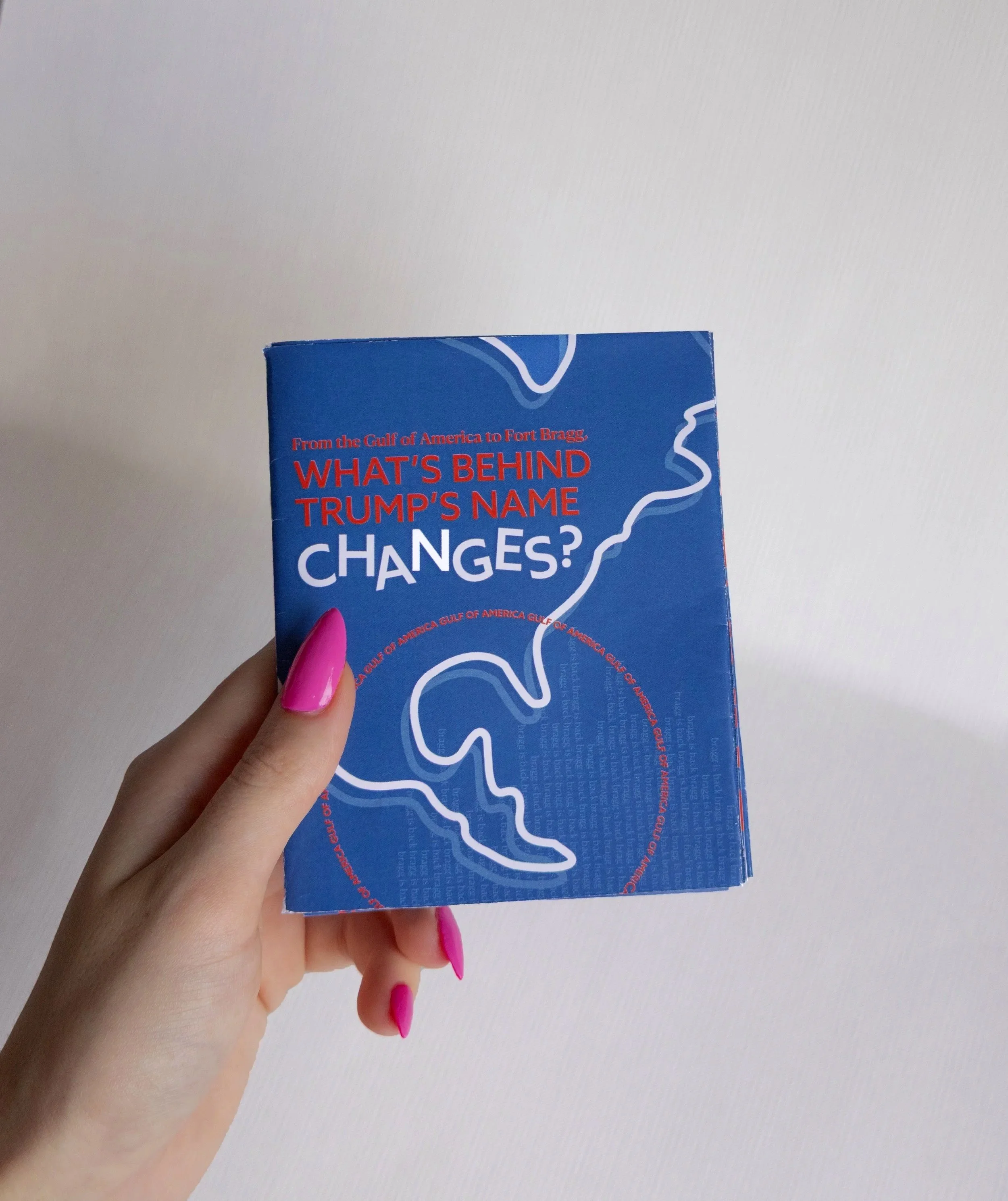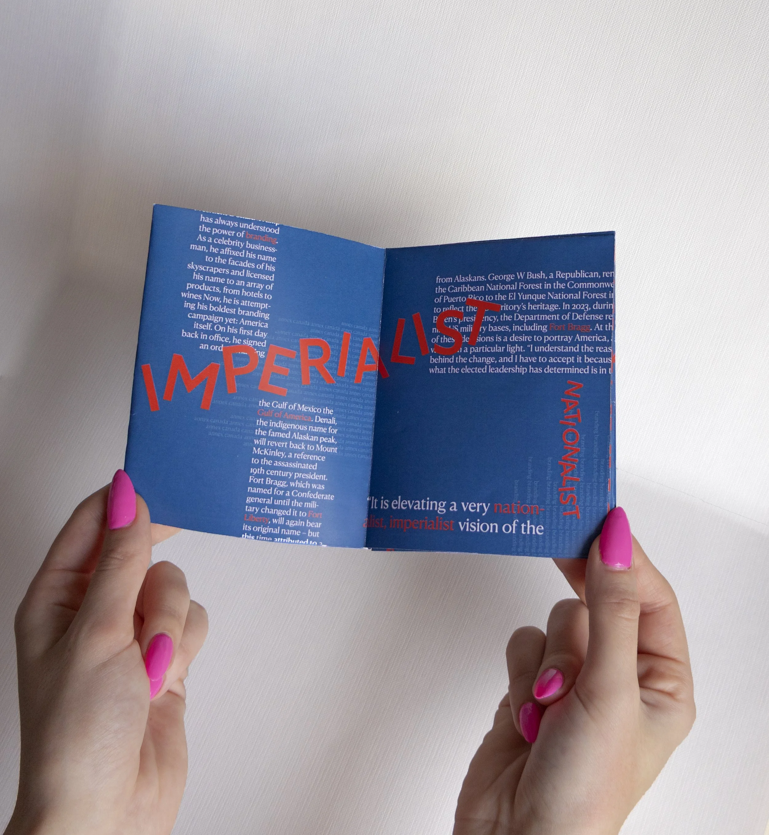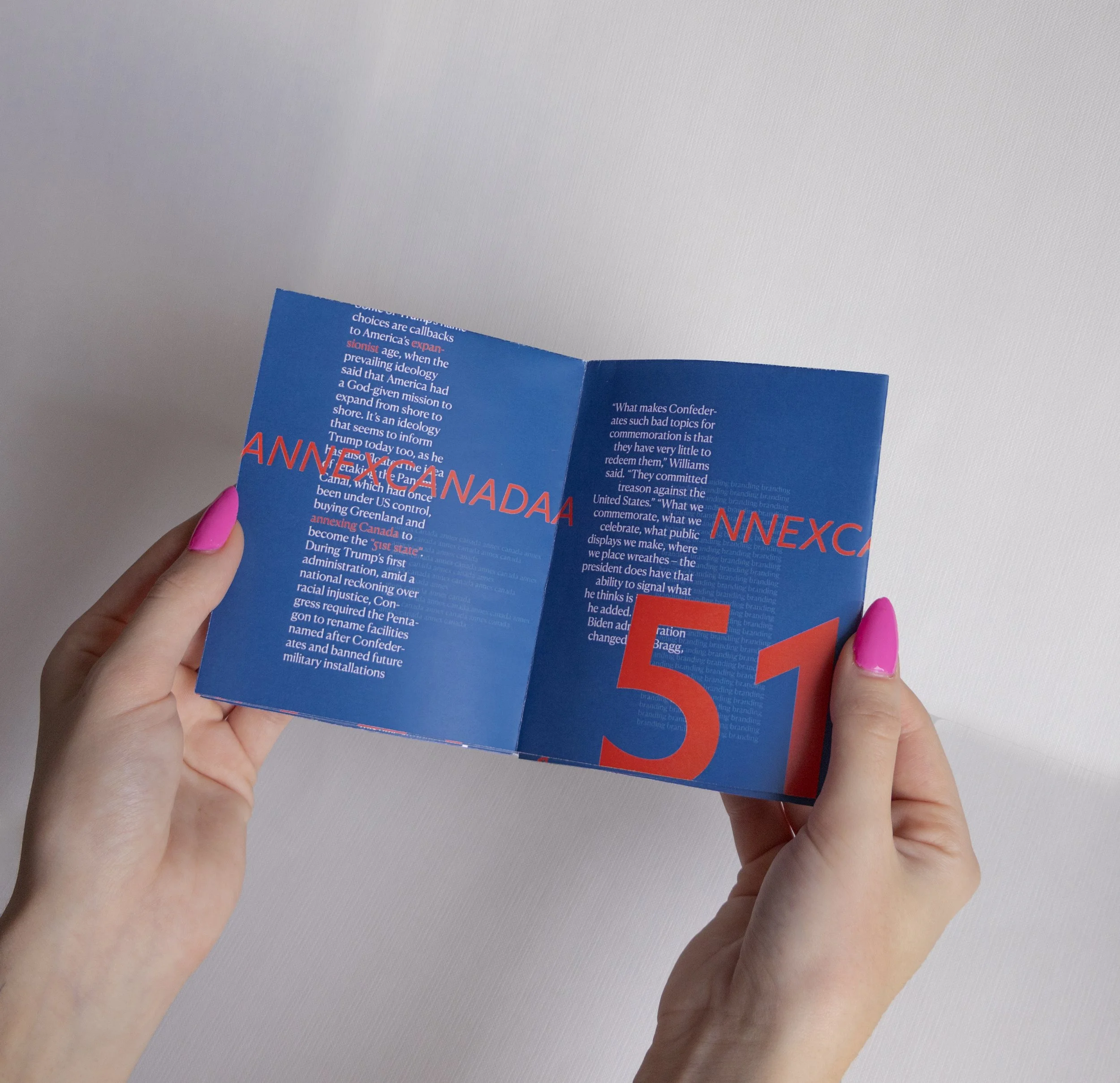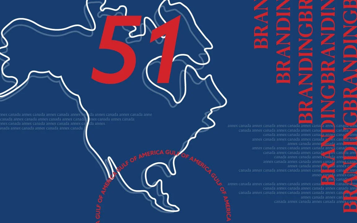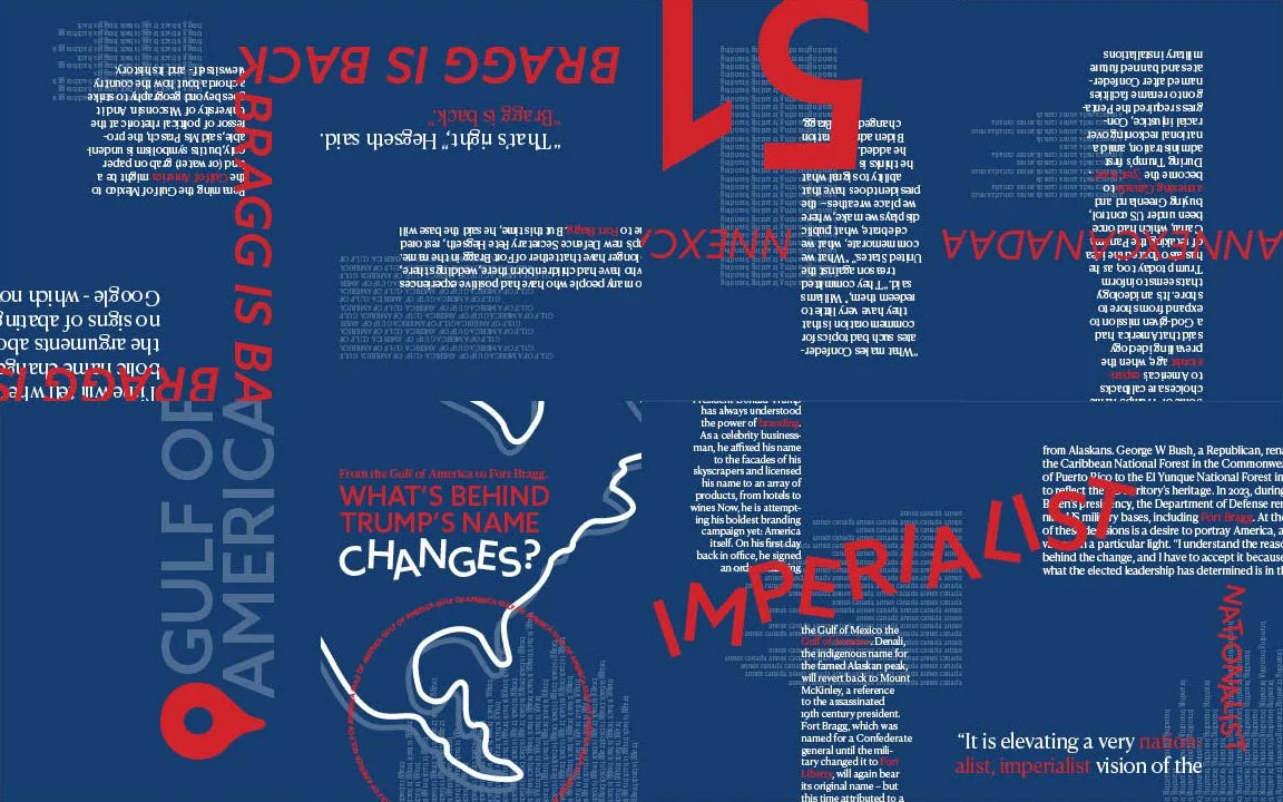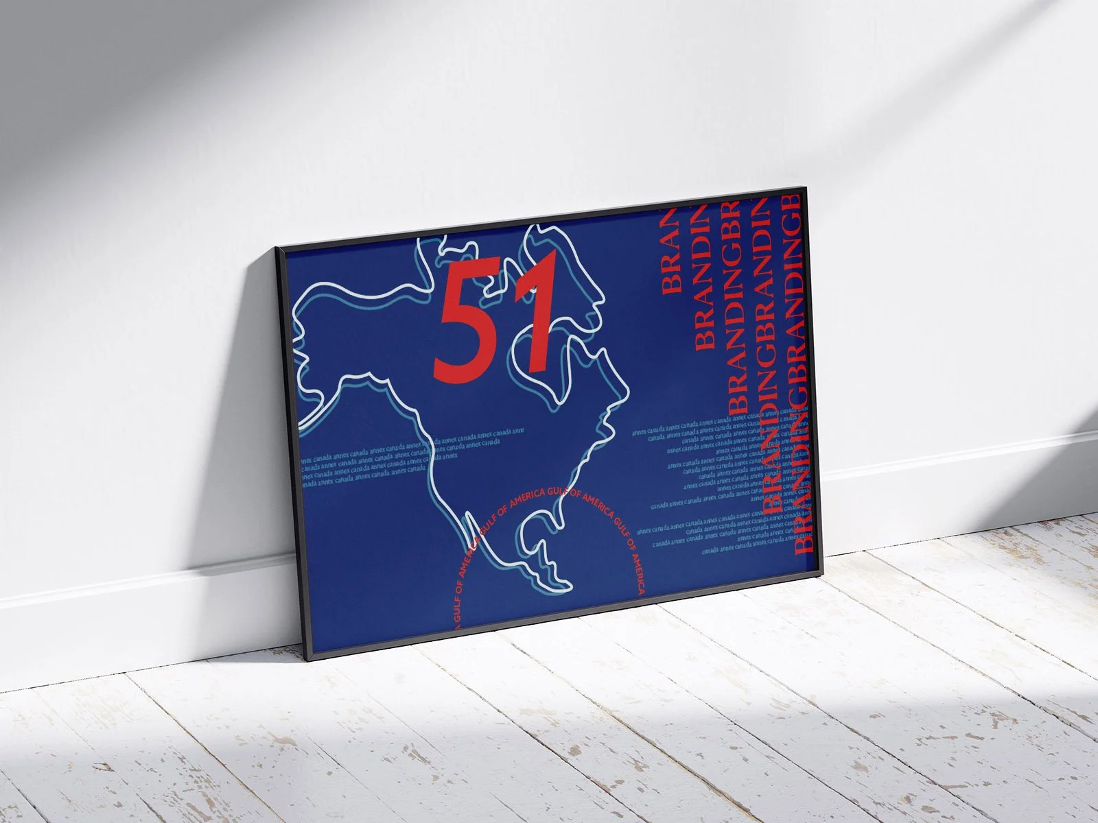
Newsletter Zine & Poster
With the intentional use of expressive typography, color, and a grid system, this zine disregards content and instead is solely a study in typography, composition, and texture. Strong verbiage and elements from the original news article were highlighted with various methods of hierarchy such as scale, color, and repetition to create visual interest and a dynamic arrangement of information that draws the viewer in.